


Front and back design here the logo has been changed to a circle to work better within the business card design. The information on the back displays the needed information a client would need.


The same design except with the logo on the front i was intending to emboss the logo.

The same as above, but it is only a one sided design. This again would have the logo embossed.
I dont feel that these business cards say anything about my practice and they dont tell anyone that sees them about my practice either. Also i aren't using this logo anymore so they are redundant. Doing these cards did make me realise that i need to think about them more and think how to put across my own practice on a business card.
With the new logo, i felt that this would be easier and the logo itself will be easier to apply and adapt to create a better design within the business card.


Front and back design. This design encompasses the logo much better and the design of it is much more in keeping with the style of work i do within my own practice. Also having the main areas i work within displayed on the business works to show clients etc what work i do the most.

This card is the same as the ones about except this encompasses all the information on one card, it will still be double sided design but the back will be orange, with a pattern maybe?


The second design has the same design to it, just laid out differently to adapt to the format of the card. Here i have tried it portrait to see how the design works on this format of the business card, in fact i do prefer this business card over the portrait one, i think that the design fits this orientation better and works better as the business card. This shows the front and back design, the front shows my name with the main three design sectors, this is mirrored on the back, but with the extra contact details as well.


I was thinking to keep the business card within the colour scheme and use the orange colour as a main colour throughout the branding. I could do the back of the business card orange, with the logo in reverse. The second one has the writing in reverse too. Out of the two i prefer it all being in white, as a full design this looks more balanced, the black doesn't stand off the orange that well, whereas the white pops off the orange.


This again is the same design, but all the information is shown on one side, the other side of the double sided print will be orange with a pattern, here i have shown a simple diagonal line to split the orange block colour up.
The final design that i am going to use for my business card is the portrait version, i prefer this design to all the others and think it works the best.
I am still unsure wether to use the orange or white back design and if to include print on the design sectors, or if i would class this as publishing.
Maybe is should display the types of design that i work within e.g. analogue, digital, environmental
Analogue being print based design. Digital being digital design and environmental being design in the environment - outside promotion, exhibition design etc.


Other variations of the design. I am going to get a second opinion on these designs to see which to include within the design.
Update on design:
I have been working on the design more and i think i need to keep the three areas more open that publishing, print, illustration or branding. I think to show on a business card this is too specific and clients would be turned off if they didnt think the work they wanted doing was within these areas.
With analogue, digital and environmental - I think this works better and shows a broader range of design areas but still being specific too. I dont like the use of analogue, so i have changed this for print.
I have also decided on using the orange back design.
So the final design for my business cards are:


FURTHER DEVELOPMENT
After looking at the designs above, i want happy with them, I wasnt happy with the information below my name, i couldnt decide which was best to display there and if it should even be there in the first place. Also i changed my mind about the use of the orange colour, i had the back being in orange, but i now think it should be the front, to make them more eye catching and this is the main colour of my personal branding. The back design i was fairly happy with, again just the information i wasnt sure about, so i have gone back to the design to look and make changes again.
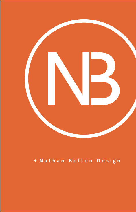
For the front of the business card, i am now going to just have my logo and name, which is nathan bolton design, because on the previous card i had no mention of design within the information so it wasnt very clear what i was trying to inform.
I have done a variation of positioning for the front card.


The image above is the final design that i am going to use, this has the best positioning of the information within the business card area.
Back design, here i was happy with the previous layout of the design, but the information needed to be changed to make right along with the colour.

I have changed the information on what design my practise does to: specialising in print and digital design. I think this is a better way to promote myself because i do have certain areas in which i do work best in and would prefer to get work for, but i wouldnt want to be turned away from a project because i havent said i work in that area of design. Putting print and digital design makes it more broad, but still limited aswell, within the website i create i will specify the areas of design that i specialise more in, but for a business card i dont think this is necessary.
Here i have also refined the design making sure it is all lined up and making the type sit better together and work as whole within the design.

Final back design.
THE BUSINESS CARD
Final business card design.

No comments:
Post a Comment