
As part of this task I will identify and analyse examples of professional designer's or design studios who have used a range of media and formats to distribute their own work. In order to analyse the work i will use the SWOT analysis.
Effektive Design Studio
We are a young, but established, design and ideas studio based in Glasgow. With a passion for what we do, we deliver relevant, considered and engaging work for clients both locally and internationally. Our approach is simple; we aim to develop strong long-term relationships with clients and suppliers; we listen, learn, understand and simplify to deliver design that adds value to our clients business. We work across business sectors from arts, culture and fashion to retail, corporate and education. This allows us to specialise in a variety of areas including identity & brand development, print design & production, digital design and design for environment.


Strengths
The format of this personal mailer is a great idea, the interactivity that the user has to do to read through the mailer, gets you involved with it and you understand the studio more. I like the front cover of the mailers, with the added insert it makes it very personal to each client / customer that the mailer is sent to, this makes you think they have taken time out to produce this for you personally.
Weakness
As far as a limitation for this, i would only say that the inside of the mailer which includes images of the work. This is only printed in black and white, which doesn't show the work off to its best ability, I also think this limited amount of work doesnt show the studio to its best.
Opportunities
As a studio i love the work and i think this mailer does show off the studio, the style of the mailer really stands out is shows the work that they do. As an opportunity i would love to work with this company and visit them.
Threats
In terms of threats, i think the only the limited imagery of work, which is all centered around one certain area could be a threat to them, it doesnt show versatility, and really is a redirection to the website.
Made By Six
We are an independent creative consultancy based in the UK, specialising in design and art direction for an international roster of clients.
Our aim is to produce design with intelligence, integrity and craft that both we and our clients can be proud of.


Strengths
Collection of work shown within the mailer is excellent, it shows a wide variety of their work and shows what the studio is all about. Keeping each sheet to A4 makes it easy to print and reproduce. Very visual throughout, great to show off the work.
Weakness
Very design based, maybe this overtakes the information that is being presented and is focussed too much on the design of the mailer and not showing off the work / getting the idea of the company and its values over to the client.
Opportunities
With a large amount produced, sending these out to all clients etc will get the company seen and a larger customer profile. The standard of the mailer, reflects the studio and shows the standard at which they work at.
Threats
High standard of work and way in which work, very specific in the target audience and clients this could be sent to.
Adrian Newell
Design and Art Direction.


Strengths
Good format to show work within, layout and structure to the mailer is great. very well organised.
Weakness
Again the imagery is in black and white, not very good to show off the work and present it in the best way. There doesnt seem to be alot of information about the designer, its just to show the work, but i would include both because its not just the work you are presenting, its you as a designer too.
Opportunities
Easy to send out to companies and clients and is a great way to have a overview of their own design practice.
Threats
Limited work shown, not enough information about the designer.
Matter Strategic Design
Matter is a strategic design firm. We help individuals, organisations, and causes matter to those who matter most to them.


Strengths
Great collection of work, organised very well through the use of the two individual books. The whole collection makes it seem like some sort of collectable item and something that is very high standard and professional. Along with the website, the studio put them self across as a very professional company with high standards of work.
Weakness
Maybe as a personal mailer for the company, this could be too much, its a big selection of work and could be seen as trying to show too much and in that case the client/customer finds it too much to take in.
Opportunities
The format and interactivity of the publication and packaging makes it seem like it is something very valuable and you have to un wrap when you receive it. Great way to communicate the company to clients, reflects the practice of the studio.
Threats
Very large collection of work, big to send out through post. Once it has been opened, it cant be put back into the packaging, which then looses the sense of unwrapping a valuable item.
Estudio Triciclo - Tricycle Studio
Formed by almost adults with guys Italo boys Bacci and Luciano Santos, the Tricycle Studio aims to work a design independent, free and creative within the mining market. Italo, post graduate in Creative Processes in Word and Image PUC / MG, developed projects in design books, catalogs, promotional pieces and cultural. Already Luciano, plus a brief academic experience as a professor of Packaging Design from the University WSCF and papers published in international books, carries on his work curriculum in the areas of visual identities and packaging. Together, living a creative rapport since college days, they created what they call 'studio processes'. With less than 1 year, Tricycle already have significant works, how the design of visual identity Good Boy! pet shop, created in partnership with professionals in architecture, being published on blogs and websites Brazilians, and has presented his case to the graphic design course at the University Fumec. The Tricycle Studio today serves customers like Floriano Bookstore & Café, Chágelado, Menu Makeover, Good Boy! pet shop, Cosci Backpacks and Autolog Express.

Strengths
Individual business card for each design within the pair. Design of the cards are in keeping with the style of the website, all consistant across the different media types. Personal image shows each designer, personalised works well.
Weakness
Very broad in terms of specialism, only displaying graphic designer doesnt really say anything about them, as they are personalised cards they could have had each personal specialism on the cards.
Opportunities
The business cards show the different personalities of the individuals within the partnership, but still make them work and look within the same company.
Threats
Limited on information and only business cards to show promotion, maybe more of a portfolio could be made.
Passport
Passport is a young and independent design bureau founded by Jonathan Finch & Rosalind Stoughton, based in Leeds.
Certain destinations and international design culture have informed and influenced our practice which is centred around print-based design for branding, identity and publications.


Strengths
Branding is very consistent throughout all project and reflect the nature of the studio, using travel as inspiration. It reflects the name of studio and works as a identity for them.
Weakness
This only shows the studio as a brand and identity, it has no real communication of who they are work wise and what sort of design work that they do.
Opportunities
The branding and whole set of products is individual to them, it is very unique and definatly reflects in the values of the studio. It certainly is something
Threats
As i have said before it works well as a identity for the studio, but doesnt show any of the past work they have done. Also I havent seen that this has been distributed, its only there to see if you come across it.
Heydays
Heydays is an Oslo-based design studio that creates strong visual concepts that trigger curiosity, create excitement and show ambition. We listen, research and challenge. We remove noise to add value.


Strengths
The branding and identity is very strong and bold, it gives a statement about the company, which is great and makes it stand out. The products are designed to a high standard and show the value of design to the company, which reflects through the work they do.
Weakness
Again there isnt much to show what the studio actually does and to show some of the work in a portfolio. The folders and books are there to have this information in and to be distributed within them, but it isnt shown, you can only see it if you get sent it.
Opportunities
The branding is over a wide range of products which use various techniques and finishes, this reflects in the type of the design that the studio does and the sort of standards they work at. Its also widely available to see. There are lots of different products which can be used in different ways to promote themselves.
Threats
No portfolio shown within the digital imagery of the work, the folders shown in the branding include this information, but not visible to online viewers. Strict target audience?
QusQus is a graphic design studio founded by Dima Kuzmichev. We love magazines and books, presentation booklets and annual reports, typography and high-quality paper. We develop trademarks design and visual identity.


Strengths
As a whole portfolio and a way to communicate the studio and what they offer to a client / customer this works really well. It has a strong layout and editorial design within the mailer and alot of information about both the design, studio and online presence. The imagery of work shown is varied but limited.
Weakness
As mentioned above, the imagery of work shown is limited, it is only printed in mono tone, which doesnt really communicate the ideas of each individual piece. With a limited selection of imagery shown, you only get the smallest glimpse of the studio work, i would personally like to see more.
Opportunities
The mailer is designed well and in line with the style of the studio, they are a print and editorial based studio, which you can tell from the design of the mailer as the standard of it is high.
Threats
Small portfolio, limited imagery not as big as insight into the work of the studio as others that i have seen.
DuoDuo
Duo D uo - a melbourne based creative studio with fashion at its core.
At duo d uo, we work directly with our clients to build long-term relationships on foundations of reliability, trust and efficiency.


Strengths
Work over a range of media, both digital and print. The business cards shown class and high quality by the use of the gold foiling within them, this also reflects in the type of design the studio create and what can be achievable with them.
Weakness
Only business cards are shown as any sort of promotional information. The website is displayed as a portfolio by only having imagery of the work throughout, but this isnt very visible to clients / people browsing the internet without any sort of promotion to direct them to it.
Opportunities
Through looking through the website and blog, the studio seems to be very in touch with trends and fashion, which you can see through the business cards and the design that they take on with there promotion material - gold and light pink - to me it reflects fashion.
Threats
Different media has been used to promote the studio and to get them seen more, but with only a business card as any sort of promotion they are only relying on word as mouth for people to actually go and look at the website.
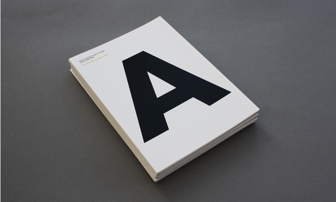
Konrad Sybilski
I graduated from graphics at the Polish-Japanase Institute of Information Technology. I'm a flexible graphic designer, enjoying every aspect of design, whatever it is. I'm in love with posters, typography, logos and illustration. Always open for new projects, freelance and exhibitions, so feel free to contact me.


Strengths
Worked over a range of media, both digital and print. Visuals of all work is very striking and reflect the design style of his practice. Really well designed and nicely made portfolio which is like a proper hard back book - shows class and high standard of work.
Weakness
All promotional material is well designed, but has this taken over the communication of the work? Would be people just look at it and think it has been designed well and looks aesthetically good, but pay no attention to it? Design has a small target audience with the style of it.
Opportunities
As a whole set of promotional material, there is alot of different avenues that can be taken to promote the designer. With both digital and print based products, which all work across the board - set a good identity for himself.
Threats
Maybe designed to how he likes it and not for the mass market which will actually be viewing the work?
No comments:
Post a Comment