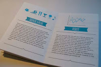
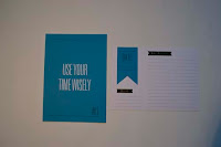
In this module I have tried to keep things simpler. The concept and idea that decided to go with I purposely decided to keep it simple, because I didn’t have lots of time on this brief, so I wanted to spend more time on designing them to keep them at standard of all my work.
I have learnt that things don’t need to be complicated to be effective and be a good piece of work, which communicates the message effectively.
I have carried on the skills that I learnt throughout the year, again taking the idea of hotdog booklets from the principles module and incorporated this into my work. I have further developed my illustration skills and experimented with publication layouts more.
Within the theory side of the module I have developed the idea of time management and how to plan my time better, learning the things which I don’t need to do and that are a waste of my time throughout the day was a good wake up call. I have learnt to change my attitude towards it and start to take more time on my work, but leaving time to socialize too.
I also feel as thought I have developed my reflective skills for both my blog and in written crits. I feel as though I can talk about things more and explain better in a more graphic design terminology to why I have chosen things the way I have. Within crits I have developed a better sense of evaluating peoples work and better a way to express this.
What approaches to/methods of design production have you developed and how have they informed your design development process?
For this brief it was all about keeping the design simple and making it effective, focusing on communicating the message right to the audience. I have experimented with publication layouts and the format of the publication. I have looked at doubled sided postcard sized designs. All these are different formats to what I would normally design around, this has been a good experience working within different formats and sizes.
By working on smaller formats and making them fold up within the design, I have had to plan out the design stage well, making sure I was using the right orientation for both the publication and the double sided cards. With using a small format too, this meant my designs had to be a lot simpler and more precise, as the size of them would be smaller.
Within the tasks and sessions in this module I have learnt that I work better if I plan my time and use ‘to do lists’ to plan my time out and decide what work I will do for the day etc. In doing this I have found that this has helped me a lot in doing my work and getting it all done efficiently.
What strengths can you identify in you work and how have/will you capitalise on these?
In this brief I feel as though the simple design is the strength of it all. I used one accent colour and black and white to create the designs. These were made up of small illustrations and then written content for the publication. I feel as though the publications were the strongest part of my work, as a set they all work well together and communicate the message; which I wanted to get across to the new first years.
I feel as though I have developed a bold design style, one that can be simple but still communicate the message to the audience efficiently. The to do list are a good example of this and show that things don’t have to be complicated to both look good and communicate well.
Within the tasks in the module I have learnt more about graphic design, understanding the meaning of different areas within the subject and being able to identify work and designers of this subject, I feel my understanding of this part of the module is one of my strengths, researching into things like this I find interesting as I am learning more and more about graphic design as well as finding new designers etc which I can use for inspiration.
What weaknesses can you identify in you work and how will you address these in the future?
I think my main weakness of this brief was that I didn’t plan it out too well, I left the designing of this brief quite late compared to normal, but I did manage to get everything finished in time, but I have felt a lot more rushed within this brief and abit more stressed than normal. As this module was a long module and has been running all through the year, looking back at some of the tasks, I found it hard to realize what they were about and hard to finish off, so I wish I had completely finished them when they were first set.
Identify five things that you will do differently next and what do you expect to gain from doing these?
- Not leave tasks unfinished – In doing them right at the beginning when set, I know that I have completed them and got them out of the way leaving more time to do the practical design briefs.
- Time management – on this brief I have felt more rushed and stressed coming to the end of the module than normal, planning my time better would have been a better plan and leaving more time to finish all the design work and tasks.
- Feedback – Getting myself prepared more for the initial crits and sessions for feedback will give myself more feedback and idea I can work off.
- Experiment more with illustrations – The illustrations within my work on this brief are quite simple, but this isn’t something that I tend do to do all the time, but I would like to develop this skill further.
- Think of the concept right from the start and stick to it – within this brief I kept changing the idea of my work and what I wanted to communicate, sticking to one and developing this right from the start will provide me with a more evident and communicated product.
Attendance = 5
Punctuality = 5
Motivation = 4
Commitment = 4
Quantity of work produced = 4
Quality of work produced = 5
Contribution to the group = 5


