Wednesday, 26 February 2014

OUGD602 // Personal Branding // Logo

To start my branding off, I looked at the what I previously had and my opinions on it was that it was too clunky and I didn't really like the typeface that I used. I felt that this was a good start for the branding and suited me last year, as it was the first time thinking about myself as a designer and how I wanted to represent that. 


But now I think it needs to change and be something that is a bit more 'designed' and more considered to my own work and my own practice. I feel that throughout this year I have grown up as a designer and I have learnt about the areas of design that I see myself working in. The branding above, doesn't relate to this and I don't feel any sort of connection with the design of it. 

I have tried a few different variations of the logo. I still want to carry on using 'nb' as I think this works well for the branding, its short and the two letters sit together really well. 

I had two different ideas that I wanted to experiment with for the new branding - a illustrated, flowing type set logo or one which uses a serif font. 

The first idea being a illustrated type set logo. I like the idea that the two letterforms are joined together and create a flow between them both, the idea of them using each other to create the full letterform is quite interesting and creates an abstract logo, which is definitely memorable.  


I started working on this idea and decided to see how little of the letterforms I could use and still make out the 'nb'. It was quite hard with 'b' as if you miss certain parts of that letterform out it becomes un readable. I think that this is a step too far, the 'n' doesnt really look like an 'n' and the whole composition of the the logo doesn't look right. 


Adding a stem onto the 'n' created the full letterform, but again this still doesn't fit together well. The white spce between the 'n' and 'b' is too much and makes the whole logo unbalanced. 

Added a small part of the stem to the bottom of the 'b', both improves the legibility of the 'n' and it also adds to the 'b'. This is by far the most legible version of the logo, but I'm still not sure about it, it is quite similar to my old branding, in the way that is it very thick stroked and clunky. I like the idea of having the bespoke typeface, but I just don't think it is working that well. 


Moving onto the second idea. This was the use of a serif font. To start off with I searched online to find a font which I liked the form of to use within my branding. After looking through many fonts, I came across Playfair. I liked the form of the typeface and the small details of the weights of the strokes within each letterform. I preferred the typeface in uppercase than lower, as I think the details of the letterforms work better within a capital letter, plus NB looks better in caps than lowercase, as it gives it a more rectangular shape with the letterforms finishing to the same x height. 

I started off using this font and tested it both in lowercase and uppercase. 


Adding a full stop to the end of the logo, I feel finishes it off. The idea of the full stop is to sort of show some assertiveness within the logo. As i previously said, I think the typeface works better in uppercase than lowercase. The letterforms are formed better within the uppercase and you can see the true serif typeface within this, the use of the different weights to the strokes in the uppercase make it more interesting. I think the lowercase letters look quite thick and chunky, compared to the uppercase, which feel as though they have a more elegant / sophisticated form to them.  


The one thing I didnt like about the the typeface was the kerning between the letters. I think that in the standard typeface, it is too large and seperates the letters too much - maybe using it as a body copy type this would be fine, but as a logo the letterforms feel too far apart. 


With this first one, I decreased the letter spacing a lot and tried to see what the logo would look like if the two letterforms were joined at the top. As you cans see, this doesnt work at all, with them joined together it creates an area of white space between the letters which doesnt sit that nice. Along with the serif on the bottom of the 'B' is creates an awkward shape between the letters which is the only thing you see when you look at the logo. 


Increasing the spacing so that the letterforms are seen as two separate forms, but much closer together creates a better composition for the logo. These feel like they are meant to be placed next to each other and even though they are separate they feel as one within the logo. I have also decreased the size of the fullstop and brought it closer to the letterforms, as again it felt like is was too distant and not part of the logo.


After working on this version of the logo, I believe this is the one to use within my branding. I really like the typeface as it is a create serif type and I love the details of the various stroke weights within the letterforms, both the letters look great in the type and fit together really well within the logo. I feel that using this serif type creates a more professional branding than my previous one, this shows more sophistication and elegance, which from where I am as a designer compared to last year, this fits really well. Also using a serif is different to what I would normally do, but I do like it. 


Mocking up the three different identities onto a business card, shows how the logos would fit within the format and sit on the product itself. As I have previously said the first logo is very similar to the previous identity, and it is evident here that they both have a thick and clunky aesthetic to them - as a designer I think this reflects in a negative way towards your practice as this maybe could communicate that your work has this similar style, which isn't great.


The final serif type looks brilliant on the business card, even though this is only a digital mock up to show how the logo fits within the space, it looks great already. Seeing that logo compared to other two, definately makes me think that the serif is the best route to go with. It looks much more design led and considered as a logo, the details make it more interesting to look at and it feels much more professional. 

Wednesday, 19 February 2014

OUGD602 // Studio Pitch

The studio Pitch was a presentation that showed the progress of the work we had completed so far. It was also a time where we could show our final briefs, after having time back at uni to tweak and improve upon the ones we had outlined before.

This was good to see where each individual was at within there own work, and it gave the tutors a better understanding of everyones practice.

OUGD602 // Manifesto

Last week we had to present a manifesto to a group of people within our year. The manifesto was something that we lead our lives by or certain things that we believed in and that helps us. The manifesto could be personal or design led.

For my manifesto I decided to do 10 points, I thought this was a good solid round number and a decent amount of statements to work off. I used statements which I could apply to both my personal life and with my design work. 


I really liked the idea of the manifesto and when I was putting mine together, it got me really thinking about the statements and what I do truly believe in.

I think that a manifesto is a really good and positive thing, its personal to each individual and gives the person / people looking at it an understanding of how you conduct yourself and what you believe in.

From doing the manifesto, I thought it would be a great idea to illustrate my own and create it into a mini brief that would break up some work I am doing at the minute. As it shows personal views etc. I thought that once I have illustrated it and created it into a small pack, I could use it as something nice to send out to studios, as it says a lot about myself.

OUGD602 // 3rd Year Presentations

At the beginning of the year we had to outline what we were going to be doing for the year, this was to include the main briefs and any other projects we wanted to get involved in. Also what sort of placements and other visits / exhibitions we would take part / visit in.


Tuesday, 18 February 2014

OUGD602 // Working Progress

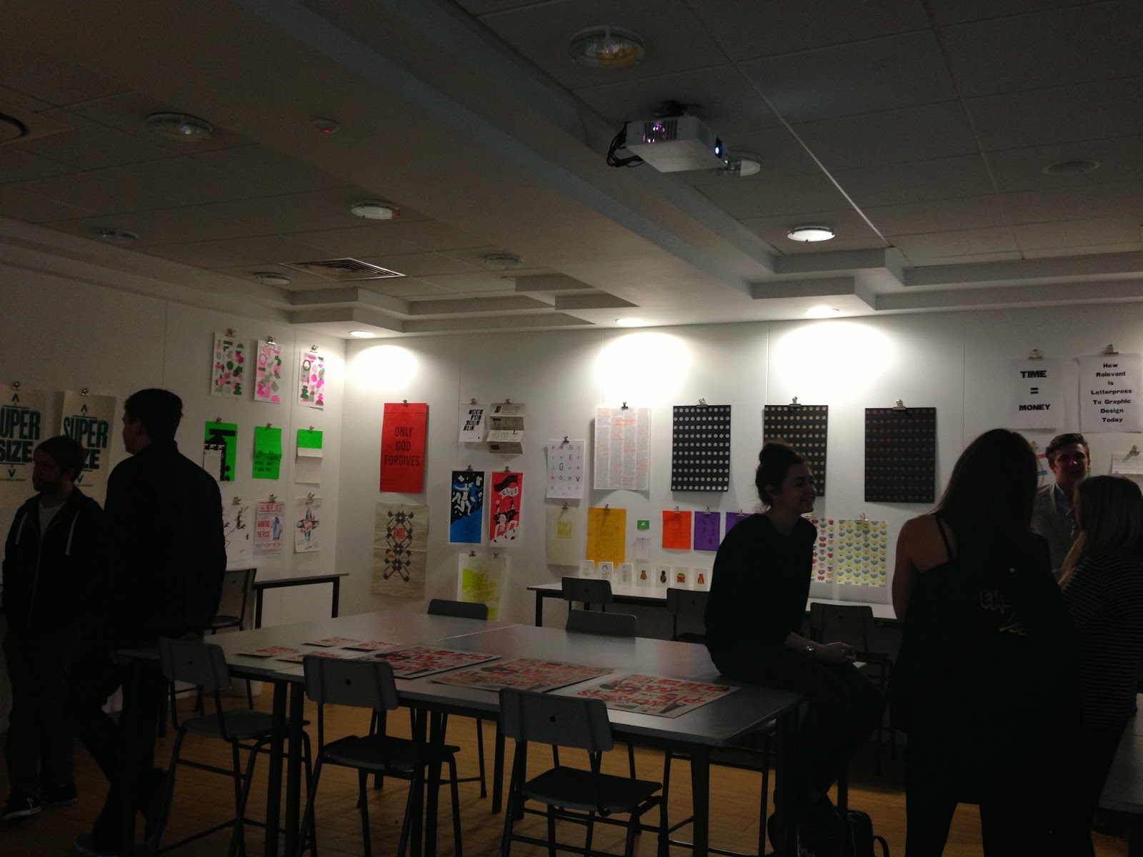
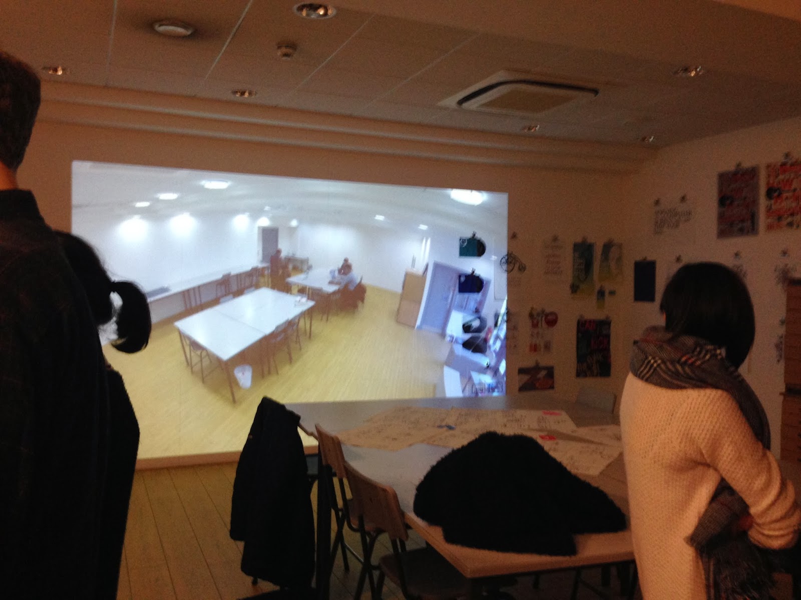
As part of the course we used the exhibition space in the lobby area of the university to put on our own exhibition.

The idea behind the exhibition was it to be a working progress - hence the name. The exhibition was to show the process that us as graphic designers go through to create design work. As work is created it would be put up on the walls to be displayed as the exhibition.

The exhibition went on for a month and we created a exhibition working group that was in charge of the exhibition and organising it. I was apart of this team as I felt it would help me within the exhibition I am putting on with Eve in one of our collaboration briefs.

On the last day of the exhibition we held a closing night, this displayed all the work created in the time the exhibition had been running and was a great success.

The exhibition space and exhibition in general:


Work that I had displayed within the exhibition:


OUGD602 // LPF

Leeds Print Festival took place over the weekend of the 24th January. Within the print fair on the saturday our course had our own table to display work on and sell.

I wanted to make the most of this opportunity and see if I could sell any of my work / get some interest in my work.

The most recent printed work that I could use was the poster I created as part of the COP module. I think these are some of the best prints I have designed are printed anyway, as they have a good concept behind them.

These posters were A2 format, printed on various GFSmith stock. It was a two colour print, using black and fluorescent orange. I put the poster up for sale for £10, which I thought was reasonable for the size and stock used on the print.

Unfortunately none of the prints did sell, but it was still good to have my work there on show and know that there was some interest in the idea behind them.


Friday, 31 May 2013

OUGD502 // Module Evaluation


 1. What skills have you developed throughout this module and how effectively do you think you have applied them?
In this module i have learnt a lot about professional practice. Before this year I didnt really know a lot about the idea of being a designer in the industry and what it took to set up a business and even the smaller things of contacting studios and talking to people in the industry. I feel that throughout this module i have gradually got better and got more confident in talking to studios and contacting them about placements etc, which has led to me getting two, two weeks placement throughout the summer, which i am proud of myself because this time last year I wouldn't have the confidence in myself and my work to go out and approach companies.
In terms of learning about businesses and how they run, i have learnt a lot through the workshops and lectures that we have had with john and fred. This has taught me more about the business side of things, which i havent got a full 100% grasp of, but i now know a lot more about the business and how i would set up my own business.

This module has improved my presentation skills both with myself and actual presentations and presentation boards through the PPP final presentation we had to do. Within this again i had the confidence to show my work and say what i thought were my strengths and weaknesses about myself.

The other skill that this module has improved is my collobaration and being able to work in group. Before coming to uni, i was a designer that liked to keep my work to myself and liked to work on my own because i knew exactly what i wanted and when i could do it. With the brief of setting up our own studio and putting the business theory into practice, i was working in a group of 4. In the end we decided not to carry on the studio group after the brief, but during it i was exposed to working with 3 other people, this improved my skills of being a team player and having to work along side other people. Not everything went really well, but overall it was a positive experience and something that i have learnt from.


2. What approaches to methods of design production have you developed and how have they informed your design development process?
A lot of this module was about blogging and doing the tasks were set to achieve certain things within the professional practice. This came down to a lot of reflective writing within my blog and evaluating myself and other peoples work.
Before doing this module this year, i felt that my reflective skills werent the best, i could reflect about my work and say what i had done, but not in a analytical way, which is what i needed to start to do. Doing this this time round has improved this skill and i now right much more about the design and break it down to the reason why i have designed it that way and how it helps communicate the message. Also i can talk about other people work much more efficiently and i feel more confident in breaking the work down to strengths, weaknesses and what i would change.

The other design set part of the module was designing our own personal branding. This to start with was really hard, as i found it difficult to try and brand myself and create something that i was happy with. But when i sat down and thought about it more it became easier and i began to enjoy it. Through doing my own branding, i have improved my branding skills, which includes logo design, layout and packaging. I feel that my promotional pack is very strong, and reflects me as a designer. Again through creating this i have used the idea of focussing on stock, format and making it interactive, which is something i have adopted throughout my own practice. I think the layout and use of colour of the identity is strong as works consistent throughout all the products i have created.

3. What strengths can you identify within your work and how have/will you capitalise on these?
I feel that my strength within this module has been the reflective writing. I have concentrated on this a lot through the year and tried to be as analytical as i could, improving this skill has helped me through this module and the other modules too.

My other strength i believe is my branding, I really enjoyed doing this and think i have created a good platform for me to carry on working from for my own personal branding. I think the promo pack is interesting and shows me as a designer, which i am going to send out over the summer to studios, so hopefully this will help me get more placements or even just to start talking with more studios.

I think my presentation skills have improved and think it was a strength within this module. I was a lot more confident when i did my presentation and knew what i wanted to say. I think my presentation was designed well and again communicated the information well. I was confident in what i was saying because i believed in my work a lot more and i was happy to show it everyone.


4. What weaknesses can you identify in your work and how willy address these in the future?
The weaknesses of this brief was probably my blog and time management. I havent kept on top of my blog throughout the year which has meant it has built up with what i needed to post and do, this has led to certain points throughout the year having a lot to do with my blog. Also i could of maybe blogged more about work that i have been getting interested in and just things i found interesting within the world of graphic design. But mainly it comes down to time management.


5. Identify five things that you will do differently next time and what do you expect to gain from doing these?

Keep up to date with blogging - this will stop the build up of more and more posts and ask needed to be completed, it also will keep me up to date and knowing that i dont have it to do. It takes away time from other areas of my work also.

Blog more regular and more things - I feel as though i could of blogged about the things which i have become more interested in throughout the year and maybe more about work i have found etc online, just so i had it there as a scrap book / reference which i could look back on.

Time management - This module has been one which has run throughout the whole year, at certain points its the one module which gets pushed to the back and forgotten about - i think if i planned it out more then it could have been stronger and i would have been able to do the things which i spoke about above.

Put myself in a collaboration more - I think as i found this collaboration within this module so vital and useful for me knowing what i want to do when i finish the course and the sort of studio i would want to work in, I could ask peers within our year to do more collaborations and try out different things within this, this again will give me more experience and maybe inform me more about where id want to work after uni.

Keep up with contacts and networking - Throughout this module we have been told about networking and contacting studios, which i started to do fairly early on, but after contacting the first couple, i drifted away from this and stopped doing it. I think if i had kept up with how i had started i could be in a position with more contacts and being able to put myself out into the industry more.


Attendance - 5
Punctuality - 5
Motivation - 5
Commitment - 5
Quantity of work produced - 4
Quality of work produced - 4
Contribution of the group - 4